
KitProgress
Determinate progress bar expressed as a fraction.
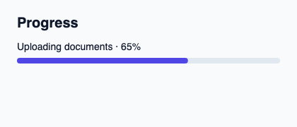
Project progress through value from 0 to 1 and supply a contextual label. Keep exact counters and fraction calculation in the controller.
bounded-value clamps rendering to the interval and the accessible percentage is rounded. The component neither animates invented progress nor manages the task.
Complete example
This complete Slint file is a visual composition used to produce the screenshot above. Internal strings without a label property retain the kit’s default language; system dialogs follow the host platform. Projected state and callbacks requesting a decision need host wiring; the standalone fixture does not supply that controller. Set up the Rust project, then see the typed controller application for working editing, validation and selection.
// SPDX-License-Identifier: GPL-3.0-or-later
import { KitProgress, KitTheme, KitThemes } from "@kit/kit.slint";

export component Example inherits Window {
    title: "KitProgress example";
    preferred-width: 420px;
    preferred-height: 180px;
    max-width: 100000px;
    max-height: 100000px;
    background: root.theme.canvas;
    in-out property <KitTheme> theme: KitThemes.light;
    in-out property <string> status;
    VerticalLayout {
        padding: 24px; spacing: 16px; alignment: start;
        Text { text: "Progress"; color: root.theme.text-primary; font-size: 20px * root.theme.text-scale; font-weight: 600; }
        KitProgress { theme: root.theme; label: "Uploading documents · 65%"; value: 0.65; }
        if root.status != "": Text { text: root.status; color: root.theme.text-secondary; font-size: 12px * root.theme.text-scale; wrap: word-wrap; }
    }
}
Public API
Inherits VerticalLayout.
The declarations below come from the component source. Parent properties remain available; see the controller guide for state management.
Properties
| Name | Type | Direction |
|---|---|---|
theme |
KitTheme |
in |
value |
float |
in |
label |
string |
in |
bounded-value |
float |
out |