
KitInputGroup
Shared input surface for editors and their adjoining content.
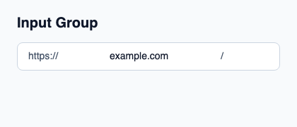
Place a native editor and its prefixes or actions in one child layout. Project access, validation and focused from the composed control.
The surface owns the background, border, inset and focus ring without creating an editor or keyboard target. ValidationPresentation.invalid colors the border as an error.
Complete example
This complete Slint file is a visual composition used to produce the screenshot above. Internal strings without a label property retain the kit’s default language; system dialogs follow the host platform. Projected state and callbacks requesting a decision need host wiring; the standalone fixture does not supply that controller. Set up the Rust project, then see the typed controller application for working editing, validation and selection.
// SPDX-License-Identifier: GPL-3.0-or-later
import { KitInputGroup, KitInputGroupText, KitTheme, KitThemes } from "@kit/kit.slint";

export component Example inherits Window {
    title: "KitInputGroup example";
    preferred-width: 420px;
    preferred-height: 180px;
    max-width: 100000px;
    max-height: 100000px;
    background: root.theme.canvas;
    in-out property <KitTheme> theme: KitThemes.light;
    in-out property <string> status;
    VerticalLayout {
        padding: 24px; spacing: 16px; alignment: start;
        Text { text: "Input Group"; color: root.theme.text-primary; font-size: 20px * root.theme.text-scale; font-weight: 600; }
        KitInputGroup { theme: root.theme; HorizontalLayout { spacing: 8px; KitInputGroupText { theme: root.theme; text: "https://"; } TextInput { font-size: 14px * root.theme.text-scale; vertical-alignment: center; text: "example.com"; color: root.theme.text-primary; } KitInputGroupText { theme: root.theme; text: "/"; } } }
        if root.status != "": Text { text: root.status; color: root.theme.text-secondary; font-size: 12px * root.theme.text-scale; wrap: word-wrap; }
    }
}
Public API
Inherits Rectangle.
The declarations below come from the component source. Parent properties remain available; see the controller guide for state management.
Properties
| Name | Type | Direction |
|---|---|---|
theme |
KitTheme |
in |
control-size |
ControlSize |
in |
access |
FieldAccess |
in |
validation |
ValidationPresentation |
in |
focused |
bool |
in |
padding-inline |
length |
in |
padding-block |
length |
in |
Types and variants
Names below use Slint syntax. Shared Rust domain types live in slint_kit; presentation enums come from the Rust types generated by Slint.
| Type | Declaration |
|---|---|
enum ControlSize |
compact, medium, comfortable |
enum FieldAccess |
editable, read-only, disabled |
enum ValidationPresentation |
pristine, checking, valid, invalid |