
KitMenuBar
Horizontal bar of stable-identity navigation actions.
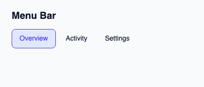
Supply OptionRow and SelectState from the controller and acknowledge activations by token and generation. Use it for a row of actions or destinations.
Left and right arrows request previous and next steps. Horizontal scrolling reveals the active item when the bar exceeds available width.
Complete example
This complete Slint file is a visual composition used to produce the screenshot above. Internal strings without a label property retain the kit’s default language; system dialogs follow the host platform. Projected state and callbacks requesting a decision need host wiring; the standalone fixture does not supply that controller. Set up the Rust project, then see the typed controller application for working editing, validation and selection.
// SPDX-License-Identifier: GPL-3.0-or-later
import { KitMenuBar, KitTheme, KitThemes, SelectionAvailability } from "@kit/kit.slint";

export component Example inherits Window {
    title: "KitMenuBar example";
    preferred-width: 420px;
    preferred-height: 180px;
    max-width: 100000px;
    max-height: 100000px;
    background: root.theme.canvas;
    in-out property <KitTheme> theme: KitThemes.light;
    in-out property <string> status;
    VerticalLayout {
        padding: 24px; spacing: 16px; alignment: start;
        Text { text: "Menu Bar"; color: root.theme.text-primary; font-size: 20px * root.theme.text-scale; font-weight: 600; }
        KitMenuBar { theme: root.theme; rows: [{ token: 11, generation: 1, label: "Overview", description: "Project summary", disabled: false }, { token: 23, generation: 1, label: "Activity", description: "Recent changes", disabled: false }, { token: 38, generation: 1, label: "Settings", description: "Project preferences", disabled: false }]; state: { open: false, generation: 1, active-index: 0, active: { present: true, token: 11 }, selected: { present: true, token: 11 }, selection-availability: SelectionAvailability.available }; activate(token, generation) => { root.status = "Activated stable token " + token; } }
        if root.status != "": Text { text: root.status; color: root.theme.text-secondary; font-size: 12px * root.theme.text-scale; wrap: word-wrap; }
    }
}
Public API
Inherits Rectangle.
The declarations below come from the component source. Parent properties remain available; see the controller guide for state management.
Properties
| Name | Type | Direction |
|---|---|---|
theme |
KitTheme |
in |
control-size |
ControlSize |
in |
rows |
[OptionRow] |
in |
state |
SelectState |
in |
accessible-name |
string |
in |
Types and variants
Names below use Slint syntax. Shared Rust domain types live in slint_kit; presentation enums come from the Rust types generated by Slint.
| Type | Declaration |
|---|---|
enum CloseReason |
escape, outside-press, system-back, trigger-toggle, programmatic, host-closed |
enum ControlSize |
compact, medium, comfortable |
enum NavigationStep |
next, previous, first, last, page-next, page-previous |
struct OptionRow |
token: int, generation: int, label: string, description: string, disabled: bool |
enum SelectionAvailability |
absent, available, unavailable |
struct SelectionRef |
present: bool, token: int |
struct SelectState |
selection-availability: SelectionAvailability, selected: SelectionRef, active: SelectionRef, open: bool, active-index: int, generation: int |
Callbacks
navigate(NavigationStep)activate(int, int)dismiss(CloseReason)typeahead(string)
Functions
take-focus()reveal(left: length, right: length)handle-key(event: KeyEvent) → EventResult