
KitMenu
Vertical menu with virtualized options and controlled navigation.
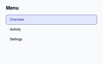
Provide rows and state, then forward navigate, activate, dismiss and typeahead to the controller. Supply an accessible-name describing the action set.
The menu keeps a shared keyboard target and reveals the active option. Selection, disabled-option skipping and typeahead remain in the controller.
Complete example
This complete Slint file is a visual composition used to produce the screenshot above. Internal strings without a label property retain the kit’s default language; system dialogs follow the host platform. Projected state and callbacks requesting a decision need host wiring; the standalone fixture does not supply that controller. Set up the Rust project, then see the typed controller application for working editing, validation and selection.
// SPDX-License-Identifier: GPL-3.0-or-later
import { KitMenu, KitTheme, KitThemes, SelectionAvailability } from "@kit/kit.slint";

export component Example inherits Window {
    title: "KitMenu example";
    preferred-width: 420px;
    preferred-height: 260px;
    max-width: 100000px;
    max-height: 100000px;
    background: root.theme.canvas;
    in-out property <KitTheme> theme: KitThemes.light;
    in-out property <string> status;
    VerticalLayout {
        padding: 24px; spacing: 16px; alignment: start;
        Text { text: "Menu"; color: root.theme.text-primary; font-size: 20px * root.theme.text-scale; font-weight: 600; }
        KitMenu { theme: root.theme; rows: [{ token: 11, generation: 1, label: "Overview", description: "Project summary", disabled: false }, { token: 23, generation: 1, label: "Activity", description: "Recent changes", disabled: false }, { token: 38, generation: 1, label: "Settings", description: "Project preferences", disabled: false }]; state: { open: false, generation: 1, active-index: 0, active: { present: true, token: 11 }, selected: { present: true, token: 11 }, selection-availability: SelectionAvailability.available }; activate(token, generation) => { root.status = "Activated stable token " + token; } }
        if root.status != "": Text { text: root.status; color: root.theme.text-secondary; font-size: 12px * root.theme.text-scale; wrap: word-wrap; }
    }
}
Public API
Inherits Rectangle.
The declarations below come from the component source. Parent properties remain available; see the controller guide for state management.
Properties
| Name | Type | Direction |
|---|---|---|
theme |
KitTheme |
in |
control-size |
ControlSize |
in |
rows |
[OptionRow] |
in |
state |
SelectState |
in |
accessible-name |
string |
in |
row-height |
length |
in |
Types and variants
Names below use Slint syntax. Shared Rust domain types live in slint_kit; presentation enums come from the Rust types generated by Slint.
| Type | Declaration |
|---|---|
enum CloseReason |
escape, outside-press, system-back, trigger-toggle, programmatic, host-closed |
enum ControlSize |
compact, medium, comfortable |
enum NavigationStep |
next, previous, first, last, page-next, page-previous |
struct OptionRow |
token: int, generation: int, label: string, description: string, disabled: bool |
enum SelectionAvailability |
absent, available, unavailable |
struct SelectionRef |
present: bool, token: int |
struct SelectState |
selection-availability: SelectionAvailability, selected: SelectionRef, active: SelectionRef, open: bool, active-index: int, generation: int |
Callbacks
navigate(NavigationStep)activate(int, int)dismiss(CloseReason)typeahead(string)
Functions
take-focus()ensure-active-visible()