
KitField
Basic column that groups a label, editor and supporting messages.
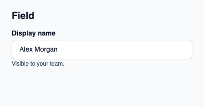
Compose KitFieldLabel, a control and KitFieldDescription or KitFieldError in that order. Use KitFieldGroup between multiple fields.
It applies the kit’s help spacing and keeps its natural height. It owns no value or validation state.
Complete example
This complete Slint file is a visual composition used to produce the screenshot above. Internal strings without a label property retain the kit’s default language; system dialogs follow the host platform. Projected state and callbacks requesting a decision need host wiring; the standalone fixture does not supply that controller. Set up the Rust project, then see the typed controller application for working editing, validation and selection.
// SPDX-License-Identifier: GPL-3.0-or-later
import { KitField, KitFieldDescription, KitFieldLabel, KitTextField, KitTheme, KitThemes } from "@kit/kit.slint";

export component Example inherits Window {
    title: "KitField example";
    preferred-width: 420px;
    preferred-height: 220px;
    max-width: 100000px;
    max-height: 100000px;
    background: root.theme.canvas;
    in-out property <KitTheme> theme: KitThemes.light;
    in-out property <string> status;
    VerticalLayout {
        padding: 24px; spacing: 16px; alignment: start;
        Text { text: "Field"; color: root.theme.text-primary; font-size: 20px * root.theme.text-scale; font-weight: 600; }
        KitField { KitFieldLabel { theme: root.theme; text: "Display name"; } KitTextField { theme: root.theme; text: "Alex Morgan"; } KitFieldDescription { theme: root.theme; text: "Visible to your team."; } }
        if root.status != "": Text { text: root.status; color: root.theme.text-secondary; font-size: 12px * root.theme.text-scale; wrap: word-wrap; }
    }
}
Public API
Inherits VerticalLayout.
The declarations below come from the component source. Parent properties remain available; see the controller guide for state management.